Infrastructure diagrams
How infrastructure gets drawn — and the current shift from static diagrams to live topology views. The trigger: OpenShip’s Services Canvas — a deployment platform whose infra view is an interactive node graph: apps, databases, running instances and routes on one canvas, each service openable and editable in place. Their “closer look at PostgreSQL” shot is the aesthetic reference: dark canvas, one primary + two read replicas, connection lines carrying the replication semantics.
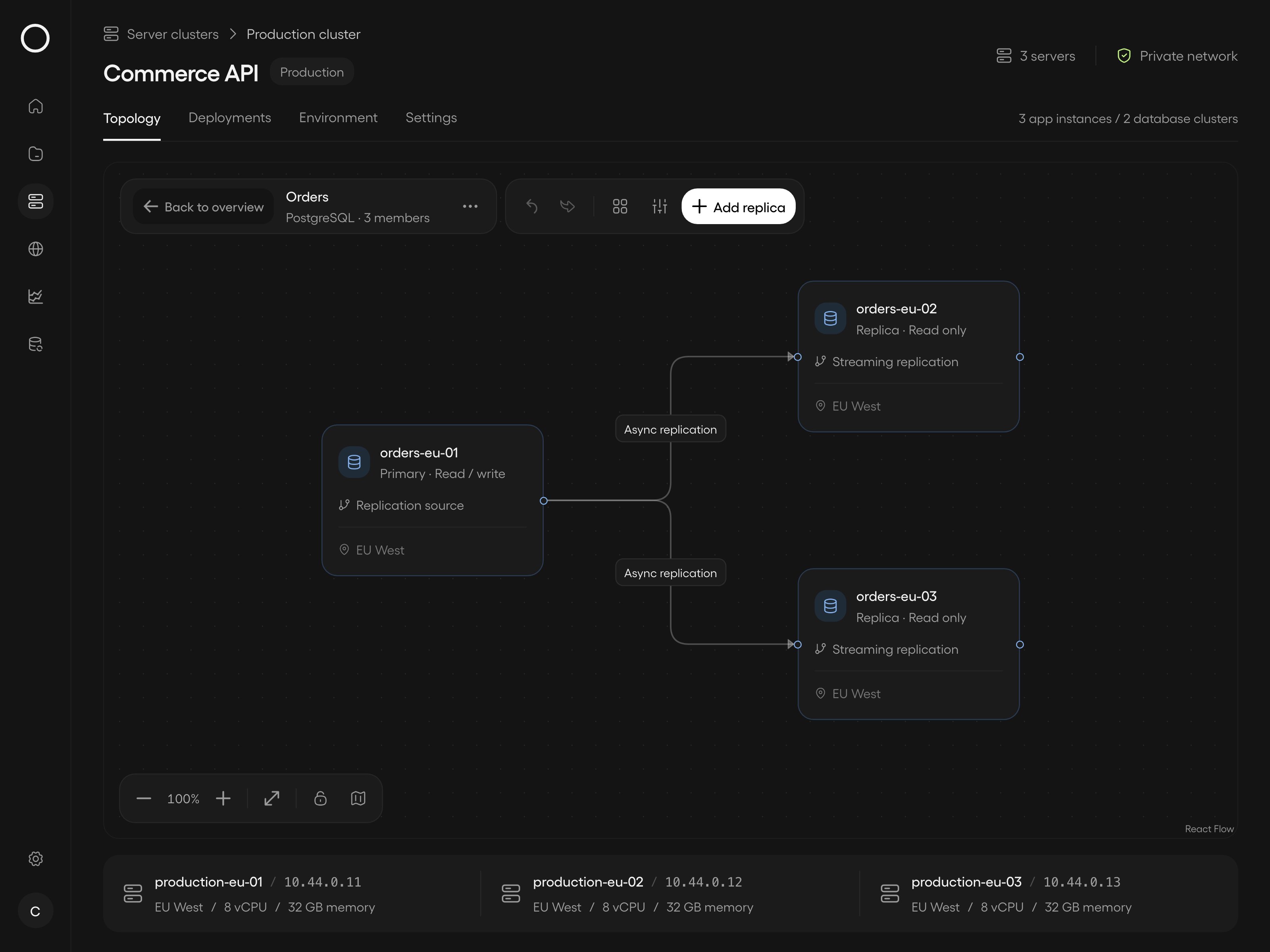
OpenShip Services Canvas — PostgreSQL primary, two read replicas, connections (archived from the tweet; the canvas is the product’s topology view, added 2026-09).
The two schools
Static / diagram-as-code — the diagram is a document, versioned with the infra it describes:
- Mermaid — GitHub/GitLab-native rendering, the default for READMEs; weak layout control for big graphs
- PlantUML — old workhorse, expressive, ugly-by-default rendering
- D2 (Terrastruct) — the modern declarative one: good default layouts, themes, the “diagrams that look designed” pitch. Its layout engine TALA is now open source (used to be commercial — HN 49858513, atombender’s comment): beats Mermaid and ELK in practice, and adds the manual-control escape hatches — direction per container, nearness constraints, shape pinning. That closes most of the “auto-placement won’t let me decide how it looks” gap.
- Reladraw — the 2026-09 newcomer born exactly in that gap: a text language for diagrams where you say where things go — declarative structure like Mermaid, explicit placement like draw.io, designed to work for humans and agents alike (Claude skill + playground on the repo). Position as the manual-control pole of the diagram-as-code spectrum.
- Graphviz — the layout engine underneath half the field; DOT as the lingua franca
- mingrammer/Diagrams — Python: infra from real code (
Diagram("homelab") >> [nodes...]), node icons for AWS/GCP/on-prem - Canvas tools (Excalidraw, draw.io) — freehand; great for early design, drift from reality guaranteed
Live / topology-from-truth — the diagram is a view over state, generated from what actually exists:
- OpenShip Services Canvas — topology as the primary ops UI (inspect, click through, act)
- Service-mesh and cluster UIs — Kiali (Istio), Kubernetes dashboards: traffic and dependency graphs rendered from telemetry
- NetBox-style DCIM — physical topology as data, diagrams as queries
The static school answers “what is the design”; the live school answers “what is running right now”. The interesting current move is deployment platforms (OpenShip here) making the live view the interface — topology you can act on, not just admire.
Why it matters for the garden’s projects
- The Homelabs notes and the homelab hardware docs keep port maps and rack layouts — ASCII/keystone tables as the KISS static school; a Diagrams.py or D2 script would be the next step up when ASCII stops scaling
- Golden repo docs section: diagram-as-code (Mermaid/D2 committed next to the code) beats binary .drawio files — reviewable diffs, no format rot
- Agent-era angle: agents read diagrams-as-code well (text in, text out) and can maintain them in CI — a drift check (“regenerate diagram, fail if diff”) is the documentation-drift-audit pattern applied to pictures; live canvases invert it by having no separate diagram to drift
Related captures: OpenShip tweet thread x-2104174735030472999 (canvas + MCP-driven DevOps: “your coding agent can now be your DevOps engineer”); images archived under assets/infrastructure-diagrams/. OpenShip itself: github.com/oblien/openship, open source + self-hostable, OpenShip Cloud in beta.
- drawio-skill (OSS) — agent skill turning code/IaC/live clusters into .drawio models with incremental sync and diagram-as-test CI (see Agent skills)